In the world of branding, logos are the visual ambassadors of a company's identity, silently conveying messages that extend beyond mere aesthetics. Yet, beneath the surface of many well-known logos lies a world of hidden meanings and clever symbolism waiting to be discovered! From hints to the company's ideals to graphics that are so well-hidden that only an expert can see them! Come explore with us the hidden meanings behind the shapes, colors, and lines of the logos we see on a daily basis as we try to decode the visual language of brands!
The Amazon Logo: From A to Z With a Wink and a Smile!
The Amazon logo hides a clever message within its simplicity. The iconic arrow starts at 'A' and smoothly glides to 'Z,' signifying the vast range of products available on the platform. This subtle design choice implies that Amazon is your one-stop destination for everything from A to Z. The arrow also cleverly doubles as a smile, suggesting customer satisfaction. This logo encapsulates Amazon's commitment to providing an extensive selection and a positive shopping experience!
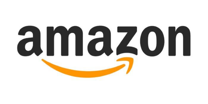
So, next time you see the arrow in the Amazon logo, remember that it's not just a smile—it's a symbol of the endless possibilities the online retail giant offers!
Nike's Swoosh: A Symbol of Limitless Potential
The Nike logo, known as the "Swoosh," is an emblem of simplicity with a profound message. The iconic checkmark represents movement, speed, and motivation, embodying the brand's core philosophy – to inspire athletes and individuals to push their limits. The Swoosh was designed by Carolyn Davidson in 1971, symbolizing the wing of the Greek goddess Nike, who personifies victory. The simplicity of the design reflects the brand's focus on performance and innovation!

Beyond aesthetics, the Nike logo represents determination and excellence. It's a motivating slogan that says, "Just Do It" and shows that you have what it takes to succeed!
FedEx's Hidden Arrow
The FedEx logo harbors a sneaky surprise in its design. Take a closer look at the negative space between the 'E' and the 'x,' and voila! An arrow materializes. This cleverly hidden arrow symbolizes speed, precision, and the forward momentum of the company's global courier services. It is a subtle touch that, once noticed, transforms the logo into a dynamic representation of FedEx's commitment to swift and reliable deliveries!

It's a hidden message that echoes FedEx's dedication to swift and reliable service, reminding customers that their parcels are not just being shipped but propelled with purpose!
Pinning Brilliance: The Clever Symbolism in Pinterest's Logo
The Pinterest logo, seemingly simple at first glance, holds a clever and meaningful twist. While it appears to be a red circle with a 'P' inside, there is more to it than meets the eye. The 'P' isn't just a letter; it cleverly symbolizes a pin. The design mimics the act of pinning something to a board, aligning perfectly with Pinterest's concept of users pinning and curating inspiring content!

In spite of its seeming simplicity, the logo manages to capture the core essence of the platform, which is that it is a place for the collection, organization, and exchange of ideas in a visual format!
The Apple Logo: Biting Into Innovation and Symbolism
The Apple logo is a masterpiece of simplicity with a touch of symbolism. The iconic apple with a bite taken out of it serves as a clever play on words, representing a "byte" of information in the world of technology. The missing chunk implies forward momentum, suggesting that Apple is always moving ahead, breaking new ground. The bitten apple also carries a hint of the forbidden fruit from the Garden of Eden, adding an extra layer of intrigue!

The Apple logo, with its minimalist design and nuanced symbolism, encapsulates the brand's philosophy: marrying cutting-edge technology with a touch of humanity, making it not just a logo but an emblem of the brand's identity!
The Toyota Logo: Where Hearts, Wheels, and Innovation Meet
The Toyota logo is more than just a symbol; it tells a story. If you look closely, you'll notice three ellipses intertwined. These represent the heart of the customer, the heart of the product, and a continuous pursuit of technological advancements. It's like a visual promise from Toyota: a dedication to crafting cars that resonate with people and evolve with cutting-edge technology. The overlapping circles convey unity, emphasizing the harmony between drivers, vehicles, and progress!

Toyota's logo is a small but powerful reminder that each journey with their cars is part of a bigger narrative—where innovation and customer satisfaction drive side by side!
Goodwill's Smiling Logo: A Symbol of Community
Goodwill's logo carries a simple yet profound message. It’s a clever play on the letter 'g,' appearing as a friendly smiling face at first glance. But beyond the initial impression of a happy emoticon, it's interesting to discover that the entire design is a magnified 'g.' This simple yet powerful design communicates a welcoming atmosphere, reinforcing the idea that every donation and purchase contributes to creating opportunities and building a brighter future!

Beyond its letters, Goodwill's brilliant blue color conveys trust and approachability, representing its aim to empower people through employment and education, and the smiling face represents the joy and optimism of professional and personal growth!
Baskin-Robbins Logo: Unveiling the Sweet Secret of 31 Flavors
The logo for Baskin-Robbins is more than just an eye-catching image. The initials "BR," in pink and blue, stand out immediately as the brand's trademark. However, take a closer look, and you'll notice that the pink part of the logo also forms the number "31." Not at all at random, since Baskin-Robbins is famous for providing a different flavor of ice cream every day of the month (for a total of 31)!

This logo combines a seemingly simple design into a visual representation of the brand's key identity, making it a memorable and engaging symbol for ice cream enthusiasts!
IBM's Logo Unveiled: A Symbol of Equality Beyond Technology
IBM's logo is a masterclass in hidden symbolism. At first glance, it's a simple arrangement of three letters, but there's more beneath the surface. The white lines cutting through the blue letters may seem like mere design, but they represent equality. The parallel lines are strategically placed to signify equal sign bars, emphasizing IBM's commitment to fairness and impartiality. This subtle inclusion communicates a powerful message, subtly woven into the visual identity of the company!

It transforms a corporate logo into a statement, reflecting IBM's values beyond technology—a nod to a world where inclusivity and equality are not just principles but integral parts of the design!
Decoding the Dual Beauty of the Mira Logo
The Mira logo is a visual puzzle that sparks intrigue. Is it a human face or two dogs' nose to nose? The answer lies in the art of reflection. This clever design captivates with its duality, leaving room for interpretation and engagement. Uncertainty encourages viewers to see beyond the surface and appreciate diverse views. The incorporation of reflections not only adds an element of creativity but also suggests a dynamic and ever-changing nature of the brand!

Thanks to the clever use of optical illusions, logo designers like Mira were able to transform a plain image into something that people could talk about and that beautifully portrayed the adaptability of the brand!
Winking Innovation: The LG Logo
The LG logo, with its sleek simplicity, conceals a clever message within its two letters. The "L" and "G" are artfully arranged to resemble a winking face, symbolizing LG's commitment to innovation and customer satisfaction with a friendly touch. The smiling face within the logo signifies the brand's dedication to making customers happy and satisfied with their products. Moreover, the letters "L" and "G" also hint at the company's tagline, "Life's Good!"

This subtle play on letters not only reflects LG's optimistic outlook but also invites users to see beyond the surface. It's a small yet powerful detail, turning a corporate logo into a cheerful emblem!
Cisco's Bridge to Connectivity
The Cisco logo resembles the iconic Golden Gate Bridge, symbolizing the company's role as a bridge in connecting people and facilitating communication. The lines within the bridge form an electromagnet, subtly alluding to Cisco's involvement in the transfer of data. This ingenious design communicates the company's commitment to connectivity and technological advancement. The Golden Gate Bridge motif reflects strength and stability, mirroring Cisco's position as a reliable technology leader!

This hidden symbolism in the logo showcases Cisco's dedication to seamless communication, making it not just a visual emblem but a clever representation of the company's values and mission in the tech world!
The Charm of Black Cat's Logo
The Black Cat logo is a clever play on perception, encouraging the viewer to take a closer look. At first glance, this may seem like simple text rotated 90 degrees, but there is more to it. The subtlety lies in the feline surprise hidden in the letters "C." Upon closer inspection, the letters "C" reveal cat eyes, cleverly incorporated into the design. The intentionally omitted cat adds intrigue and highlights the "Black Cat" concept!

The play on perception not only aligns with the brand's name but also adds an element of curiosity, turning the Black Cat logo into a clever and engaging piece of visual storytelling!
The Vaio Logo's Symphony of Analog and Digital
The Sony Vaio logo, a sleek and modern design, harbors a hidden meaning that reflects the brand's identity. The logo seamlessly combines analog and digital elements: the "VA" represents an analog signal, resembling an analog wave, while the "IO" is a binary code, symbolizing the digital world. The intertwining of these elements is a symbol of Sony's commitment to bridging the gap between the analog past and the digital future!

The logo's elegance and simplicity not only make it visually appealing, but it's also a clever fusion of technology and artistry, encapsulating the brand's journey in transforming traditional experiences into cutting-edge advancements!
The Aviation Legacy in BMW's Iconic Logo
The BMW logo, a propeller encased in a blue circle, is not just a sleek design; it's a nod to the brand's aviation roots. The logo traces back to the company's early days as an aircraft engine manufacturer. The blue and white color scheme mimics the colors of the Bavarian flag, paying homage to BMW's German origins. The propeller within the circle is not just a stylistic choice after all!

It symbolizes motion and progress, reflecting the brand's commitment to engineering excellence and innovation. It's a subtle reminder of the company's dynamic history, rooted in both aviation and automotive prowess!
Toblerone's Logo Unwrapped
The Toblerone logo harbors a sweet secret, cleverly blending Swiss heritage with an Alpine surprise. Take a closer look at the mountain image that is included in the logo; it's not just any mountain; it's the Matterhorn, a majestic peak in the Swiss Alps. But the intrigue doesn't stop there. Concealed within the Matterhorn silhouette is a cleverly hidden bear, an animal associated with the Swiss city of Bern!

The blend of these elements pays homage to Toblerone's Swiss roots and subtly incorporates the city's symbolism. The Toblerone logo, much like its chocolate, is a tasty blend of craftsmanship and hidden charm!
The Social Spirit of Tostitos' Logo
Hidden meaning abounds in the joyful style of the Tostitos logo. If you take a closer look, the two "T"s in the center of the logo resemble two people sharing a chip over a bowl of salsa. This clever visual not only reflects the communal aspect of enjoying Tostitos but also creates a subtle connection between people, snacks, and the joy of sharing. The yellow and red colors evoke a sense of warmth and excitement!

The overall simplicity of the design adds to its universal appeal. The Tostitos logo is more than just a chip and dip; it's a symbol of togetherness, adding a dash of fun to every shared moment!
The Joyful Essence of the Pepsi Logo
The Pepsi logo isn't just a burst of red, white, and blue; it's a playful secret waiting to be discovered. Take a closer look at the circular shape - it's not just a random design choice. The top half is like a sly grin, cleverly resembling a smiley face. The red, white, and blue colors aren't just patriotic; they symbolize Pepsi's all-American spirit. The red draws you in with excitement, the white signifies purity, and the blue exudes trust!

The logo captures the spirit of the brand and its commitment to giving a refreshing experience with every sip. It's more than just a drink; it's a celebration in every bubble!
Timeless Script of Coca-Cola's Logo
The Coca-Cola logo, an iconic script in red, is a visual testament to the brand's timeless appeal. Beyond the vibrant color, the flowing script carries a hidden message. If you look closely, you will notice that the letters "C" and "O" in Coca-Cola are connected, creating a sense of unity and continuity. This seamless connection embodies the brand's enduring legacy and the unbroken bond it shares with its consumers!

The lively, cursive-style design embodies the excitement and vitality of Coca-Cola. With a heritage stretching back to the nineteenth century, the logo pays homage to the brand's history while retaining a modern and dynamic flair!
Unilever Logo: Harmony in Diversity
The Unilever logo is a subtle masterpiece that echoes the company's diverse portfolio and commitment to sustainability. A close look reveals an enormous "U" formed by a collection of icons, each representing a different aspect of Unilever's business—a tea leaf for Lipton, a dove for Dove, and so on. This amalgamation symbolizes the unity and interconnectedness of Unilever's extensive range of brands. The hidden earth in the center underscores the company's dedication to environmental responsibility!

Beyond its visual appeal, the Unilever logo becomes a visual narrative, telling a story of unity, diversity, and shared responsibility toward a better, more sustainable future!
The Symbolic Crossroads of Carrefour's Logo
The Carrefour logo, a simple yet significant design, encapsulates the essence of the brand. The two arrows in red and blue form a stylized "C," representing Carrefour, which translates to "crossroads" in French. This clever arrangement reflects the brand's commitment to providing customers with a diverse range of choices and the convergence of various products and services at their stores. The color choice also holds significance—red symbolizes vitality and energy, and blue represents trust and reliability!

Together, these elements convey a message of a dynamic and trustworthy shopping experience. The minimalist Carrefour logo conveys the brand's commitment to convenience, variety, and a seamless shopping journey at the crossroads of quality and affordability!
Sun Microsystems: Illuminating Innovation From Every Angle
Sun Microsystems was a pioneer in the computer industry, and its influence can be seen in everything from technological advancements to the design of the company's logo. Their logo, simple yet clever, reads "Sun" in every direction you turn it. This embodies the company's commitment to versatility and adaptability, echoing its role in providing scalable solutions for diverse technological needs. The design encapsulates Sun Microsystems' ethos of illuminating possibilities from every angle!

It's more than a logo; it's a visual representation of their dedication to universal solutions, making it clear that, just like the sun, their impact radiates in all directions!
GreenLabs: Where Intelligence Meets Ecology in a Tree of Solutions
The GreenLabs logo is no ordinary tree; it's a symbolic representation of innovation and ecological harmony. While it may appear as a typical tree at first glance, a closer look reveals a clever twist – the branches and leaves form the intricate silhouette of a brain. This unique design conveys a powerful message: the fusion of human intellect and nature's wisdom. The brain-tree signifies GreenLabs' commitment to solving complex problems with environmental consciousness!

This concept exemplifies the idea that, by utilizing human intelligence, we are able to tackle even the most difficult problems while also preserving the delicate ecological balance necessary for survival!
Legacy on Ice: The Symbolic Spirit of the Montreal Canadiens Logo
The Montreal Canadiens logo is a storied emblem that encapsulates the rich history and passion of one of hockey's most iconic teams. The distinctive "C" with an embedded "H" proudly represents the team's initials, standing for "Club de Hockey Canadien." The red, white, and blue color scheme reflects the Canadiens' deep connection to their Canadian heritage. Nestled within the "C" is a subtle maple leaf, an iconic symbol of Canada!

For fans, the logo is more than a symbol; it's a badge of honor that transcends generations, embodying the spirit of resilience and excellence that defines the Montreal Canadiens in the world of hockey!
The Heartfelt Story Behind Wendy's Logo
Wendy's logo, featuring a red-headed girl with freckles, is a friendly and inviting image that holds a subtle message. The founder, Dave Thomas, named the restaurant after his daughter, Melinda, affectionately known as Wendy. The logo not only pays homage to this familial connection but also conveys a sense of warmth and homemade goodness. Wendy's gaze and the prominent use of the color red evoke a feeling of approachability and deliciousness!

Wendy's logo is a reminder of its founder's dedication to creating a welcoming atmosphere and serving meals with a personal touch, making it more than just a fast-food symbol but a beacon of family values in the industry!
Evernote's Logo: Elephant's Memory in Every Detail
The Evernote logo is a modern symbol of organization and creativity. The folded elephant ear represents the brand's tagline, "Remember Everything," subtly conveying the idea of capturing and remembering important details. The gray color suggests reliability and professionalism, while the green hue signifies growth and freshness, reflecting Evernote's commitment to continuous improvement. The folded design resembles a corner of a page, symbolizing the bookmarking and quick reference features of the app!

The logo's simplicity and adaptability reflect Evernote's user-friendly interface and platform versatility. It's a visual promise of seamless organization and easy access to ideas in the fast-paced digital landscape!
The Playful Charm of Chick-Fil-A's Clever Logo
Chick-fil-A, renowned for its delectable chicken offerings, serves up more than just a tasty menu—it is a playful wink in its logo. The capital "C" in Chick-fil-A cleverly doubles as a chicken. The innovative design seamlessly integrates the company's name with a visual representation of its primary offering. This subtle touch not only reflects a sense of fun but also communicates the brand's focus on its poultry - based menu!

It is a perfect example of how a carefully created logo can capture the spirit of a company while also adding a bit of creative flair to the mix!
Bic's Logo: Innovation and Precision in Every Stroke
The BIC logo is a clever fusion of simplicity and innovation. The iconic "Bic Boy," a schoolboy with a ballpoint pen ball for a head, is not just a playful little character; it holds a historical key. Introduced in 1960, the ball represents the tungsten carbide ball, a revolutionary feature in BIC's ballpoint pens. The consistent use of this character for over 50 years showcases brand continuity and reliability!

Derived from the name of co-founder Marcel Bich, the Bic logo not only reflects the company's heritage but also serves as a visual testament to its continuous dedication to penmanship and innovation!
Feathers of Innovation: The NBC Logo
The NBC logo, with its iconic peacock, tells a fascinating story. Each feather in the peacock's tail represents one of the six divisions within NBC, symbolizing the network's commitment to diversity and a spectrum of programming. The peacock itself was chosen for its association with the colorfulness of television broadcasting. Additionally, the peacock is strategically facing to the right, symbolizing forward progress and a constant commitment to innovation and progress!

The logo, developed in 1956, has changed, but its spirit continues to represent entertainment and the broadcasting sector. A kaleidoscope of imagination and progress, it represents NBC's television presence!
Pittsburgh Zoo's Logo: Where Nature's Beauty Takes Root in Hidden Harmony
The Pittsburgh Zoo logo is a brilliant fusion of simplicity and hidden intricacy. Initially resembling a tree, a closer look reveals a captivating story within the negative space. Cleverly designed, the profiles of a gorilla and a lion emerge, facing each other in perfect harmony. This artistic use of negative space ingeniously showcases the diverse wildlife present at the zoo, creating a visual delight for those who observe closely!

The Pittsburgh Zoo logo, with its dual identity, is a symbolic gateway to the animal kingdom, inviting visitors to explore the richness of wildlife within the zoo's boundaries!
Stripes of Triumph: The Adidas Logo
The Adidas logo isn't just three stripes; it's a stride through history with a sporty twist. Those iconic parallel lines symbolize more than just speed and movement. They represent the coming together of three forces: the athlete, the product, and the spirit of competition. But here's the kicker - the trefoil shape formed by the intersecting stripes is a nod to diversity and unity. It's a trifecta of style, performance, and inclusivity!

The simplicity of the logo captures the essence of Adidas' philosophy: embracing challenges, fostering unity, and propelling towards success. It's not just sportswear; it's a visual embodiment of a winning mindset and a shared journey towards triumph!
Eight: Creativity in Every Section
The logo of Eight, a design company, is a masterclass in creativity and simplicity. At first glance, it seems like a sleek and modern representation of the number eight. However, upon closer inspection, the brilliance unfolds — the letters of the word "Eight" seamlessly emerge from distinct sections of the number itself. This design not only showcases the company's ingenuity but also signifies the interconnectedness of its creative elements!

The number eight symbolizes balance and harmony, two essential principles in design. It's a visual narrative that speaks volumes about Eight's commitment to precision, innovation, and the artistry embedded in every aspect of their work!
Hidden Elegance: Hide's Logo
The logo for Hide encapsulates a subtle yet intriguing play on concealment. At first glance, it might seem like a simple wordmark, but delve deeper, and the magic unfolds. The letters elegantly intertwine, creating negative spaces that subtly form a discreet hiding place within the word itself. The minimalist yet intentional construction not only mirrors the brand's name but also conveys a sense of mystery and curiosity!

It's a visual representation of the very essence of "Hide," turning the logo into a captivating journey of discovery and intrigue, where the act of hiding becomes an art form in its own right!
The Stitched Story in Levi's Logo
The Levi's logo, a timeless emblem in denim culture, conceals a fascinating narrative within its iconic design. The two horses pulling in opposite directions on the back pocket patch represent the durability of Levi's jeans, illustrating their strength and resilience. The choice of horses symbolizes the rugged nature of the denim and pays homage to the brand's Wild West heritage. Also, the iconic red tab on the pocket is more than a design element!

You can notice the signature Levi's pocket cutout at the bottom of the red shape. It's more than just a logo; it's a stitched-in story of Levi's unmistakable legacy in the world of fashion!
Logo of Gillette: Precise and Sharp
The Gillette logo, a classic in the world of grooming, holds a subtle yet powerful message. The "G" in Gillette is cleverly designed to resemble the shape of a razor blade, incorporating the essence of the brand into its very letters. The sharp angles and sleek lines subtly convey precision and effectiveness, mirroring the qualities associated with Gillette products. The blue color, often associated with trust and reliability, adds a touch of dependability to the brand image!

It's a logo that represents the sharpness and reliability customers expect when they choose Gillette for their grooming needs. The logo serves as a silent promise of the cutting-edge technology embedded in Gillette's razors!
The Hidden Maestro in the London Symphony Orchestra Logo
The London Symphony Orchestra logo, seemingly a stylish arrangement of letters, holds a delightful secret for those who look closely. At first glance, it appears to be a dynamic font choice, but it's more than that. The 'L' and 'O' ingeniously come together to create the abstract silhouette of an orchestra conductor, arms outstretched in motion. This clever design encapsulates the essence of the orchestra's artistry and the conductor's pivotal role in guiding the symphony!

It's a creative touch that turns the ordinary into a visual symphony, mirroring the essence of the London Symphony Orchestra itself—an artful arrangement of elements working in concert to create something extraordinary!
Beats: Where Sound Meets Style
The Beats logo, a lowercase "b" enclosed in a circle, is a sleek embodiment of the brand's commitment to music and innovation. The lowercase "b" not only represents the initials of the brand but also subtly resembles a person wearing headphones, capturing the essence of the Beats experience. The circle encompasses the "b" like a soundwave, symbolizing the immersive and dynamic audio quality the brand is renowned for!

The clean and minimalist design reflects modernity and sophistication, aligning with Beats' position at the forefront of audio technology. The Beats logo is a visual echo of the brand's dedication. It's a beat, you can see!
Heart in Motion: Adventure and Passion of the Roxy Logo
The Roxy logo, a distinctive emblem in the world of women's action sports and lifestyle, is a dynamic representation of the brand's identity. The heart-shaped logo, featuring two mountain peaks, exudes a sense of adventure and passion. The mountains not only represent the challenging terrain of action sports but also allude to the brand's connection with nature and outdoor pursuits. The heart at the center adds a touch of femininity!

Roxy's logo represents her mission to empower and celebrate women in sports and beyond. Bold design and a lively color palette create a logo that represents a lifestyle as well as a company!
Elefont's Twist: Playful Surprise in the 'E
Unlocking the charm of the Elefont logo is like discovering a playful secret. At first glance, it seems to be just a stylish 'E,' but a closer look reveals a delightful twist—quite literally! The unique design ingeniously transforms the letter 'E' into an elephant trunk, curving and looping with an artistic touch. This hidden element adds a touch of fun to the brand, turning a simple letter into a symbol of creativity!

It's a perfect example of how a small twist in design can add a whole new layer of fun and personality, making Elefont's logo a delightful discovery for anyone who takes a moment to observe closely!
Beyond the Finish Line: Formula 1 Logo
The Formula 1 logo stands as the pinnacle of minimalism, recognized worldwide for its simplicity. Often referred to as the "unit that does not exist," this logo conceals additional meanings within its sleek design. The negative space between the black "F" and the red "1" forms a speedy visual, resembling the shape of a race car. This hidden element brilliantly captures the essence of Formula 1 racing – speed, precision, and dynamic motion!

It's a masterclass in effective design, where a few elements coalesce to encapsulate the very spirit of Formula 1 racing, making it a standout emblem in the world of motorsports!